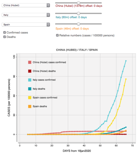
You can reach here for the interactive chart.
The COVID-19 outbreak has been the subject of various studies and infographics. One of the most used is the Visual Dashboard by Johns Hopkins CSSE.
I created this tool because I wanted to be able to compare statistics between two countries, and I haven’t found any tool in the web that would allow me to do that.
This interactive chart was created with p5.js Javascript port of Processing, together with the grafica.js library. The data is sourced daily from 2019 Novel Coronavirus COVID-19 (2019-nCoV) Data Repository by Johns Hopkins CSSE.
Features implemented:
- Time offset
- 3 or more countries
- Display DEATHS in addition to current CASES CONFIRMED
- Change values to reflect a relative “Cases per 1000 population” in addition to the current absolute “Cases”.